The Simians
We brought The Simians to life through comprehensive content marketing, creating the brand, characters, illustrations, and conducting photoshoots of toys to engage audiences across various platforms.
Create SEO-optimized blogs, articles, and social media posts to enhance your online presence and engage your audience.
Design compelling infographics and videos that boost your SEO efforts and captivate your audience.
Utilize AI for content creation, data analysis, and personalized marketing, driving efficiency and superior outcomes.
Optimize your content for voice search, ensuring it’s easily discoverable on smart speakers and voice assistants.
Produce engaging videos from concept to completion, enhancing your brand’s message and audience engagement.

We brought The Simians to life through comprehensive content marketing, creating the brand, characters, illustrations, and conducting photoshoots of toys to engage audiences across various platforms.

We enhance Samsung’s content marketing by creating high-quality 3D renderings of product and lifestyle shots, promoting home appliance launches across their website, store graphics, and social media channels.
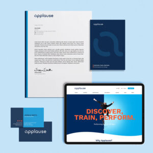
We enhanced Applause NY’s content marketing by creating a modernized logo and vibrant branding that appeals to both children and their caregivers, complemented by engaging content like the new studio slogan: “Discover, Train, Perform.”

We developed engaging content by creating custom illustrations and lively taco banter for taco wrap papers, to-go bags, and menus, enhancing the brand’s messaging and customer experience through creative content marketing.

Backlinks are crucial for SEO success, serving as digital endorsements that enhance your website’s credibility, search engine ranking, and organic traffic.

Every brand should understand how their SEO efforts can work with their email marketing strategy.

Integrating and combining marketing efforts with email marketing programs helps enrich content and boost engagement.

We share some key insights on the process of making a custom toy.
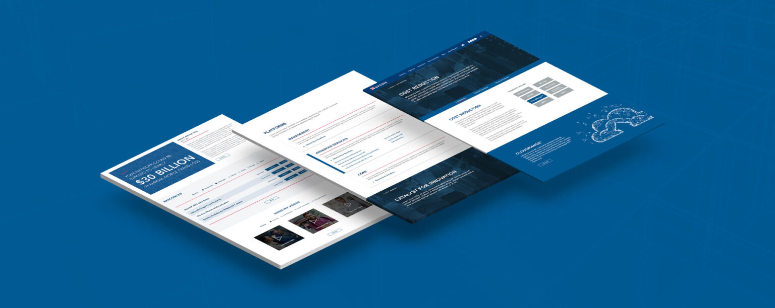
Visitors to Mavenir’s website weren’t able to quickly understand all that the company offered and why they should make Mavenir part of their next project. The site was slow, hard to navigate, and useful information was buried several pages deep from the main menu.
Mavenir needed their site to act more efficiently as a tool for their salespeople, while also driving purchase decisions from potential customers. Success would be measured on whether they continued to hear “we still don’t know what you do” after someone had viewed the site.
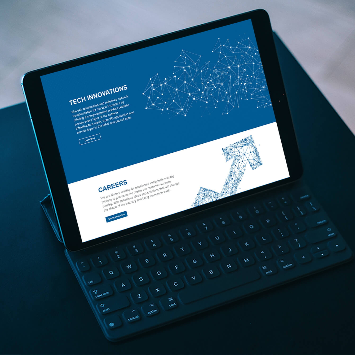
We approached the revamp website design by first doing a competitive analysis and researching effective user experience designs from a wide range of sites. With that information, we were able to design a user interface that incorporated a more effective navigation menu, concise page headlines, top-down content structure, and relevant links to secondary pages.
We sped up the site’s load time by using a lighter framework and made sure to showcase Mavenir’s value propositions on the main page so customers couldn’t miss them.
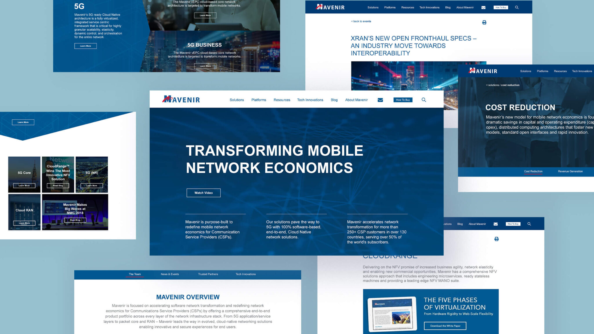
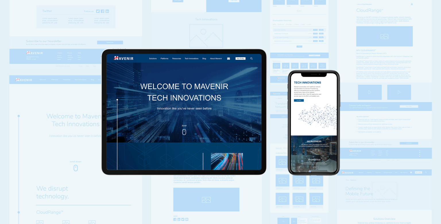
We maintained consistency with Mavenir’s current branding, while also building off of it to increasingly reflect the company’s bold attitude, using geometric patterns and well-thought placement of their signature blue. After the website design work was done, we partnered with web developers to bring the site to life in 2018.
