

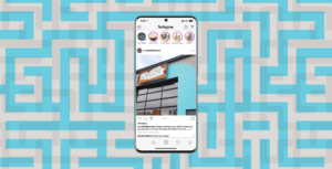


We brought The Simians to life through comprehensive content marketing, creating the brand, characters, illustrations, and conducting photoshoots of toys to engage audiences across various platforms.

We enhance Samsung’s content marketing by creating high-quality 3D renderings of product and lifestyle shots, promoting home appliance launches across their website, store graphics, and social media channels.
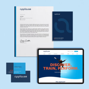
We enhanced Applause NY’s content marketing by creating a modernized logo and vibrant branding that appeals to both children and their caregivers, complemented by engaging content like the new studio slogan: “Discover, Train, Perform.”
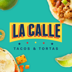
We developed engaging content by creating custom illustrations and lively taco banter for taco wrap papers, to-go bags, and menus, enhancing the brand’s messaging and customer experience through creative content marketing.

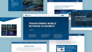
Backlinks are crucial for SEO success, serving as digital endorsements that enhance your website’s credibility, search engine ranking, and organic traffic.

Every brand should understand how their SEO efforts can work with their email marketing strategy.

Integrating and combining marketing efforts with email marketing programs helps enrich content and boost engagement.
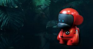
We share some key insights on the process of making a custom toy.